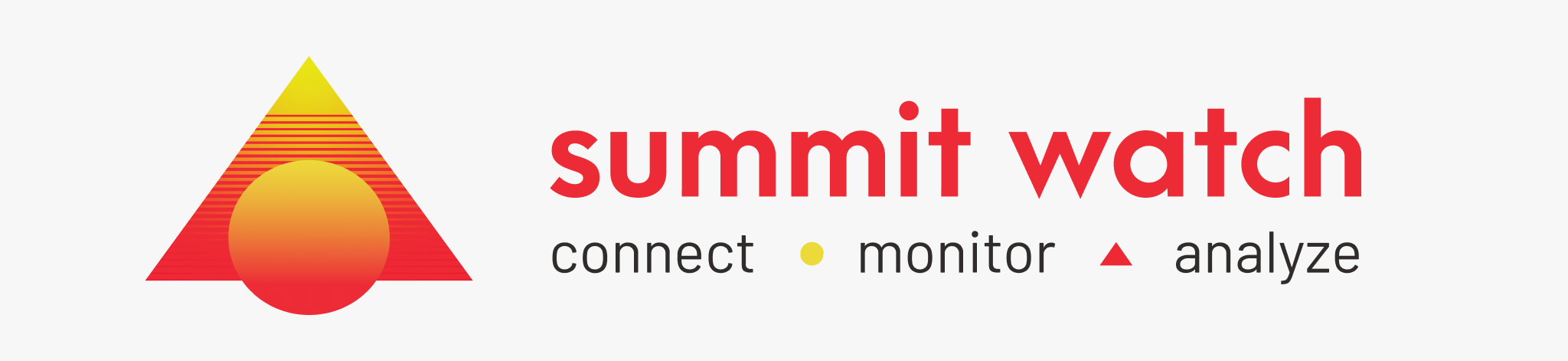

ABOUT THE PROJECT
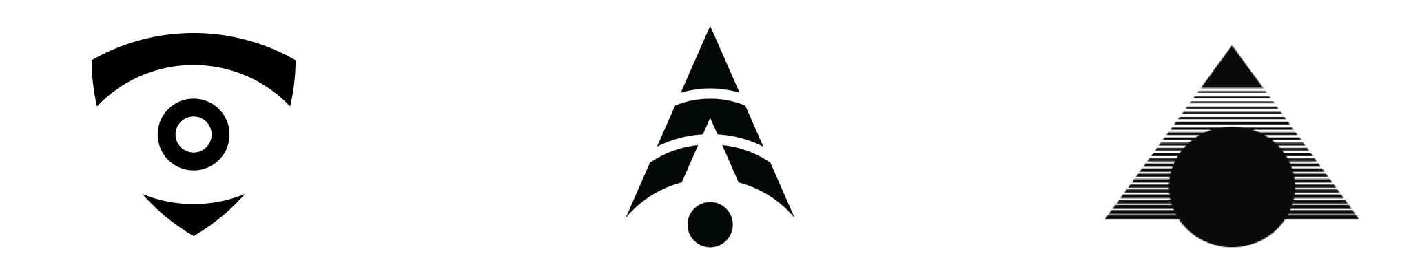
Imagine the peak of a mountain, where the view is unparalleled, and every detail of the landscape below is visible. This is the essence of "Summit Watch," The next-generation surveillance service dedicated to monitoring server-related equipment. Drawing inspiration from the majestic summits and the vigilant eye, my brand embodies the pinnacle of oversight.
The design concept marries the robustness of a mountain with the keen observation of an eye. The result? A vintage aesthetic that speaks to timeless vigilance. The palette, infused with shades of orange and yellow, doesn't just represent colors; it captures the vigor and energy of youth, symbolizing my brand's dynamic approach to surveillance.
Design Process
Logo Safe Space
Grey stripped area indicates safe zone. Other graphical and visual elements can be safely positioned up to the adjoining Blue area. “X“ indicates overall proportions for the logotype and logomark. The blue area is the extension of the triangle, it covers all the brand elements in it inorder to deliver a strong triangle feeling. Blue indicates Clear Space. The blue area must be kept free of all other graphical and visual elements. The minimum required clear space is defined by the measurement “Y“.

Logo Construction
“X“ indicates overall proportions for the logotype and logomark. The blue area is the extension of the triangle, it covers all the brand elements in it inorder to deliver a strong triangle feeling.

Typeface - Arca Majora 3
Primary font used for the logotype/logo wording.

Typeface - Barlow Bold
For default reading text, UI components.

Color Scheme

